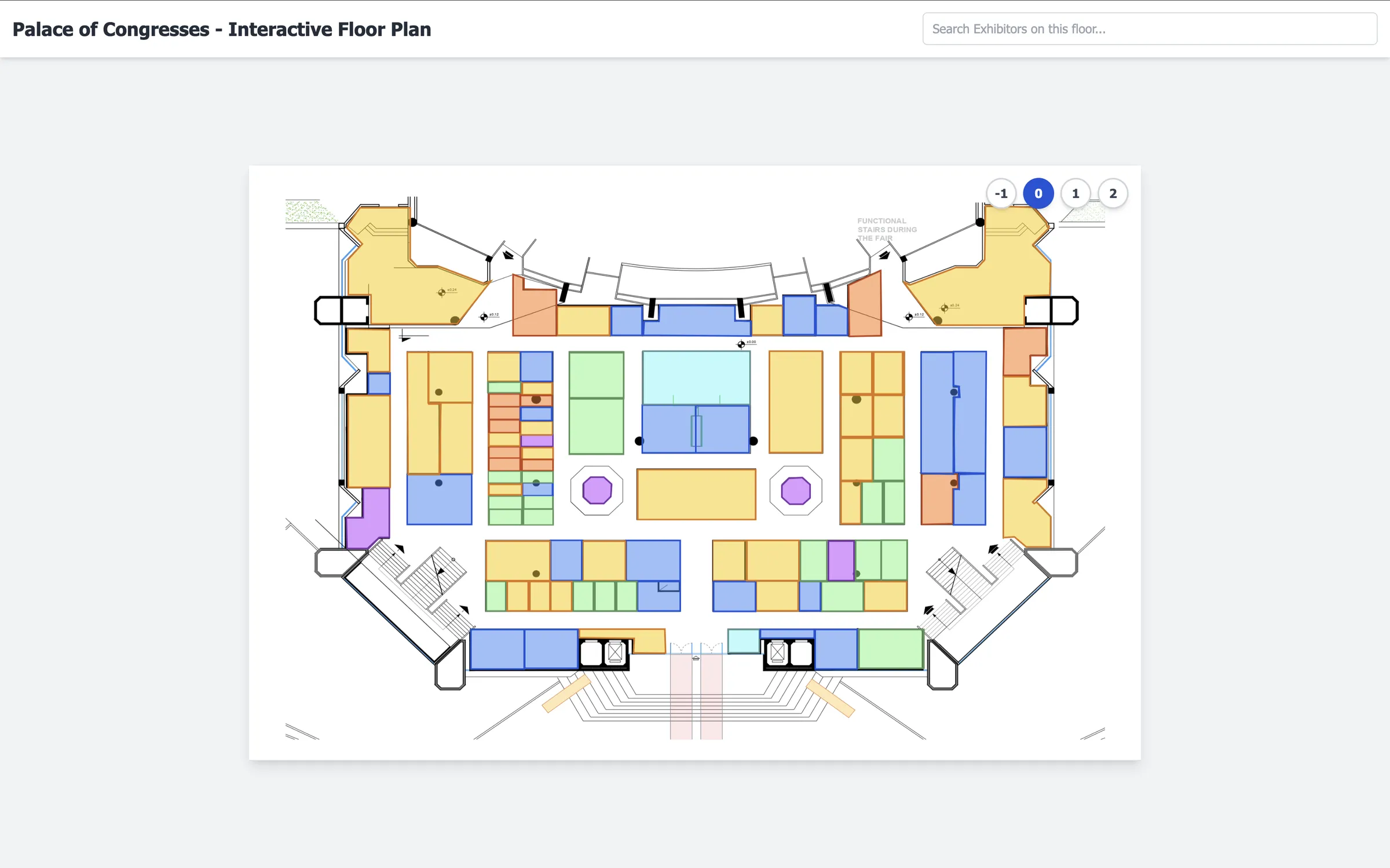
A large exhibition hall spanning several floors and over one hundred booths needed a digital map that let visitors find exhibitors easily, without labeling every booth directly and turning the map into unreadable text noise.
A color coded, interactive floor plan lets visitors navigate by sector, by floor, or by name, without ever loading more information than they've asked for.
Clicking a booth reveals a tooltip with the exhibitor name, a logo thumbnail, and its sector category, so the map itself stays clean until a visitor asks for detail.
A set of floor buttons shows one level at a time instead of superimposing every floor at once.
Booth shapes and sizes reflect actual floor space rather than uniform placeholders, giving both exhibitors and visitors an honest sense of scale and prominence.
A search bar gives visitors who already know an exhibitor's name a direct route in, alongside the visual, color based browsing path, supporting two different ways people look for what they need.
Rather than showing everything at once, the interface relies on deliberate constraints, one floor at a time, color instead of text, tooltips instead of permanent labels, to keep a genuinely large dataset navigable.
Each sector carries its own color, blue for professional services, yellow for energy and infrastructure, green for tourism and culture, so visitors can scan visually for the type of booth they want before reading a single name.
Color coding, floor by floor navigation, and on demand tooltips turn a hall with over one hundred booths into something that stays legible at any scale, whether the event grows to more booths or spans more floors.