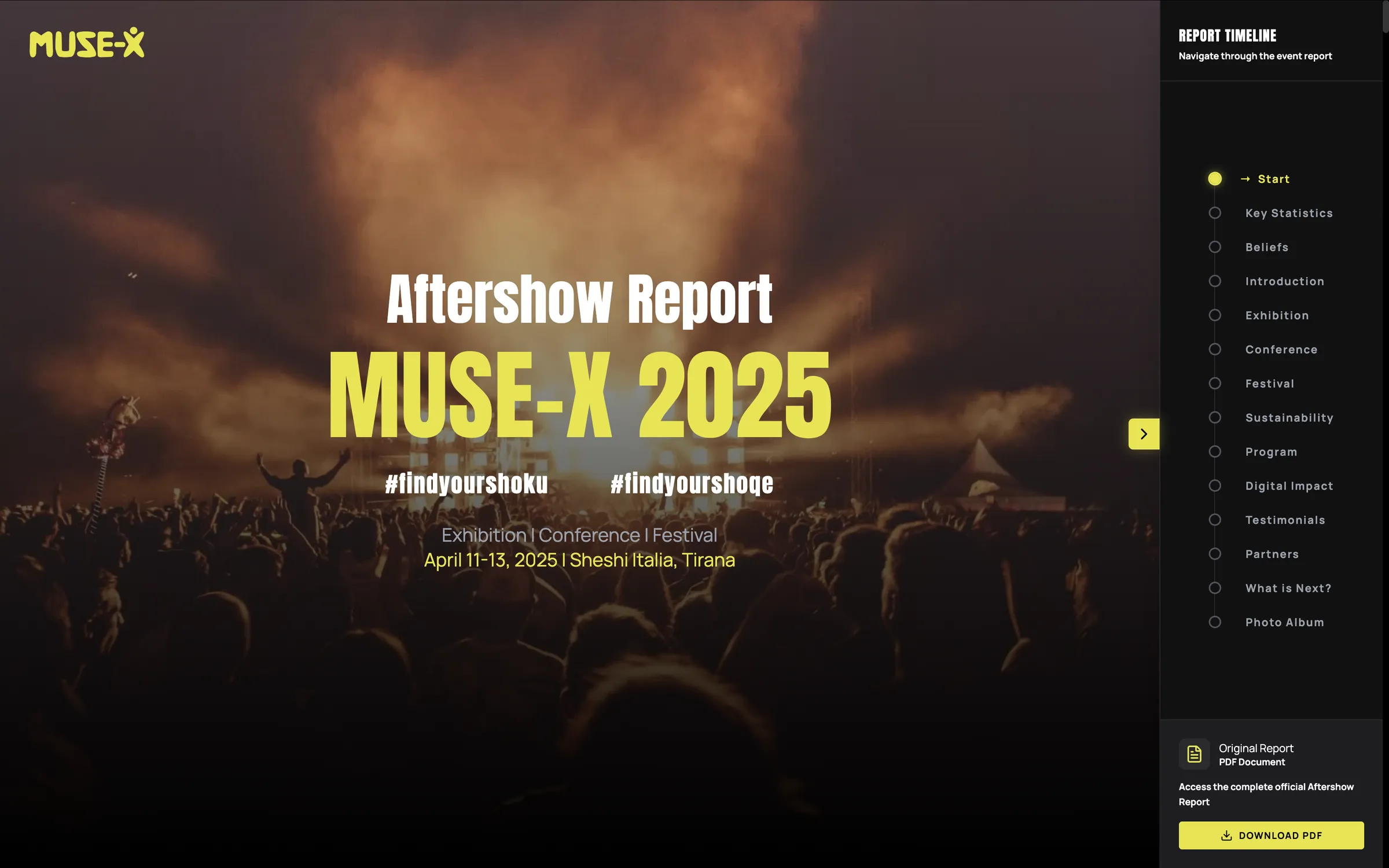
A large scale event needed an aftershow report covering eight distinct sections and over one hundred data points, exhibition space, attendance, speakers, artists, media reach, and more, without collapsing into a wall of dense prose that readers would skim past or abandon.
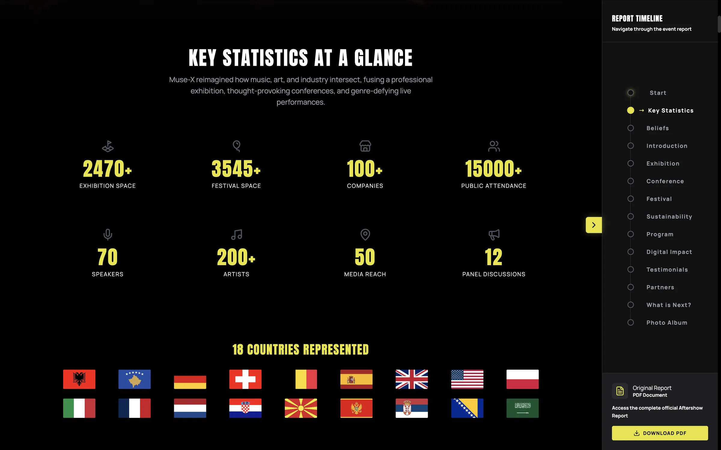
A timeline based report structure turns a long, data heavy document into a sequence readers can move through intentionally rather than scroll through blindly.
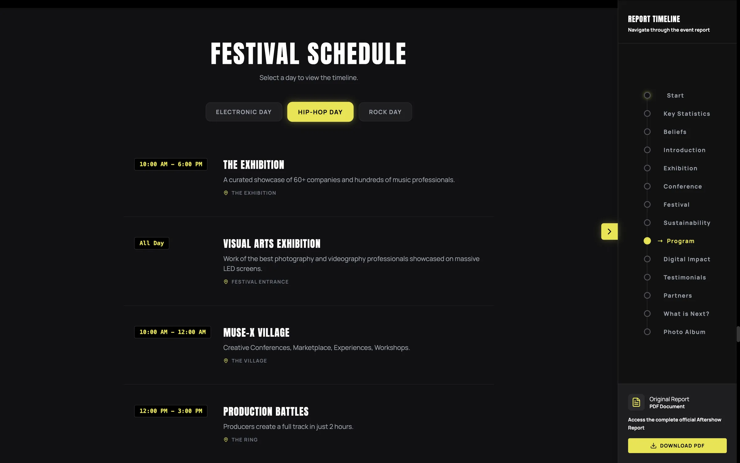
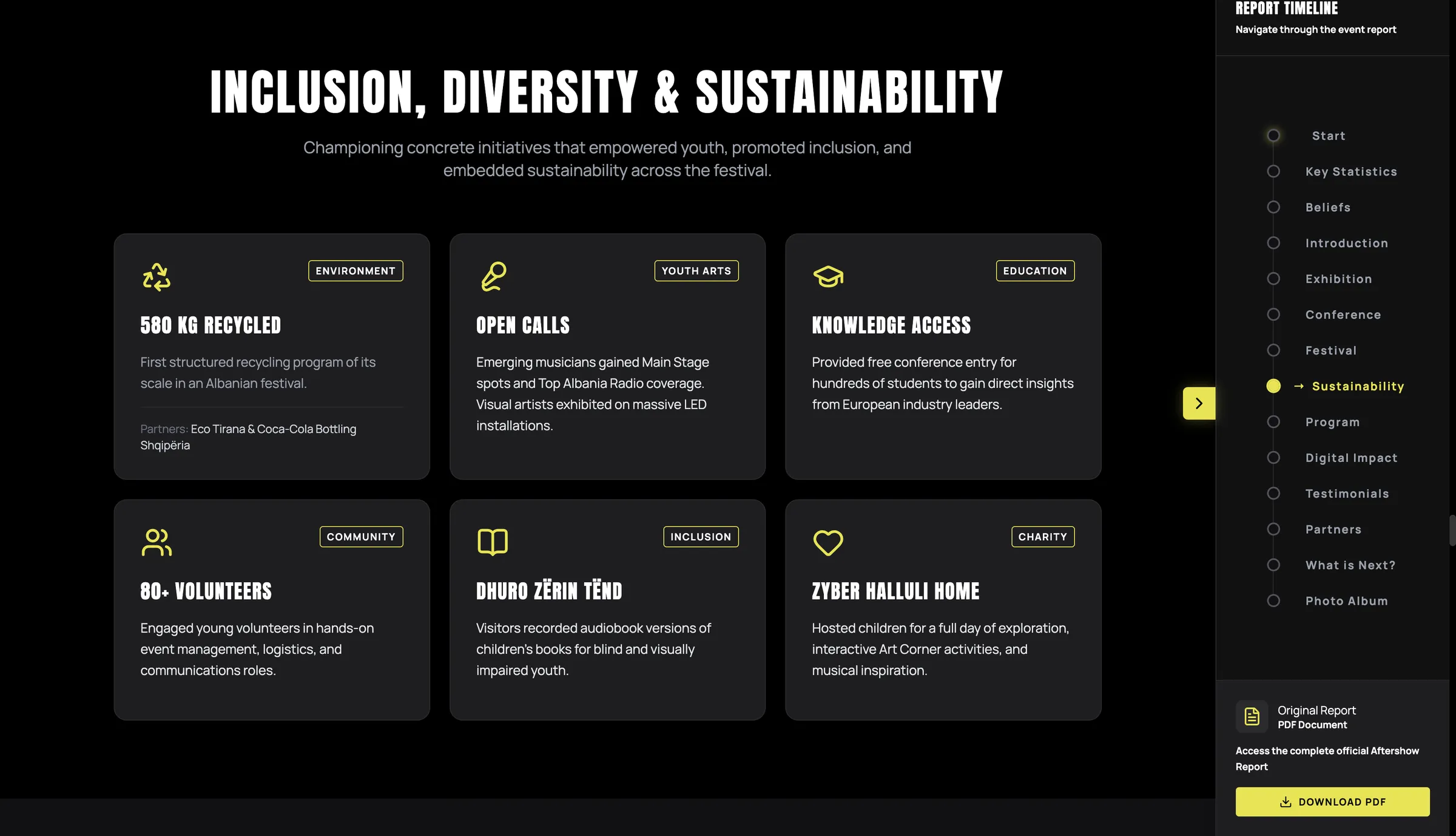
A persistent sidebar lists every section, start, key statistics, beliefs, exhibition, conference, festival, sustainability, program, and more. It works as both a map and a progress indicator, so readers always know where they are and what's left.
Sections alternate between dense data and lighter narrative moments, and are grouped by categories, creating a rhythm between quantitative data and qualitative story that keeps a long report from feeling monotonous.
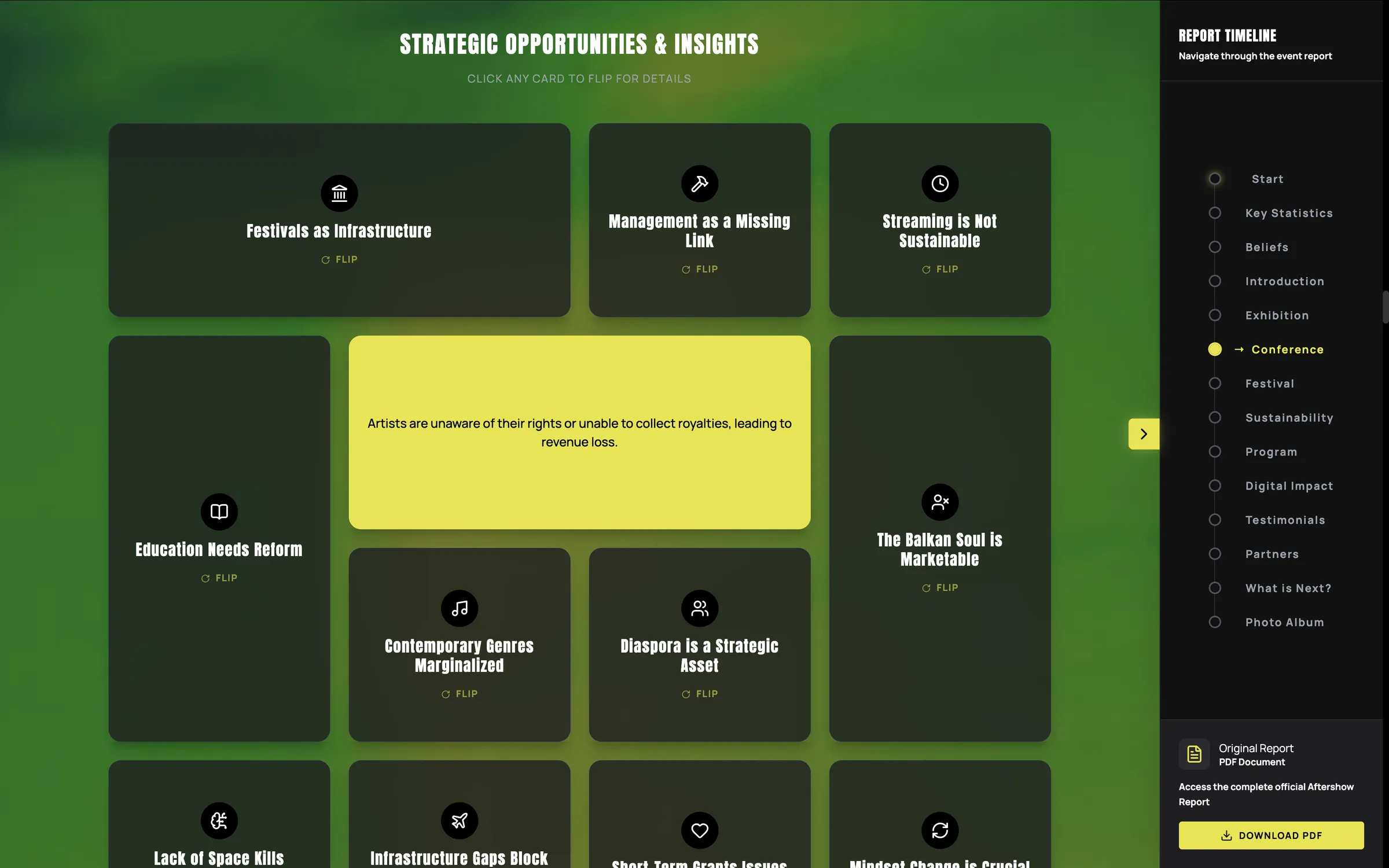
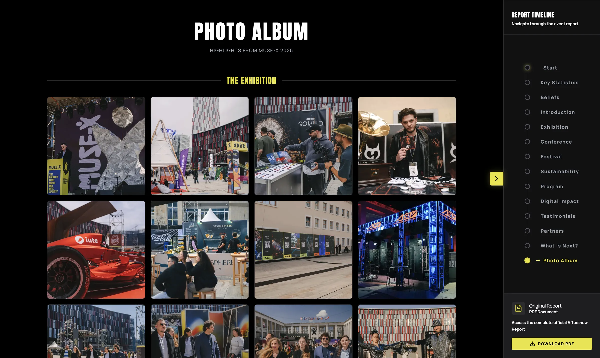
A single accent color is used consistently for critical numbers, navigation arrows, and key headings, while gray carries supporting detail. The consistency lets readers prioritize what matters without having to reread.
Exhibitor and speaker names sit behind collapsing buttons rather than appearing all at once. Readers who want a quick overview can skim past them, while those who want to explore the event in depth can expand each section on demand.
The strategic opportunities and insights section uses cards that flip on interaction. The front shows a brief insight at a glance, while the back reveals the fuller explanation, letting readers choose how much detail they want.
The gallery is split into sections that can each be expanded independently, giving readers a closer look at specific moments from the event without loading every image at once.

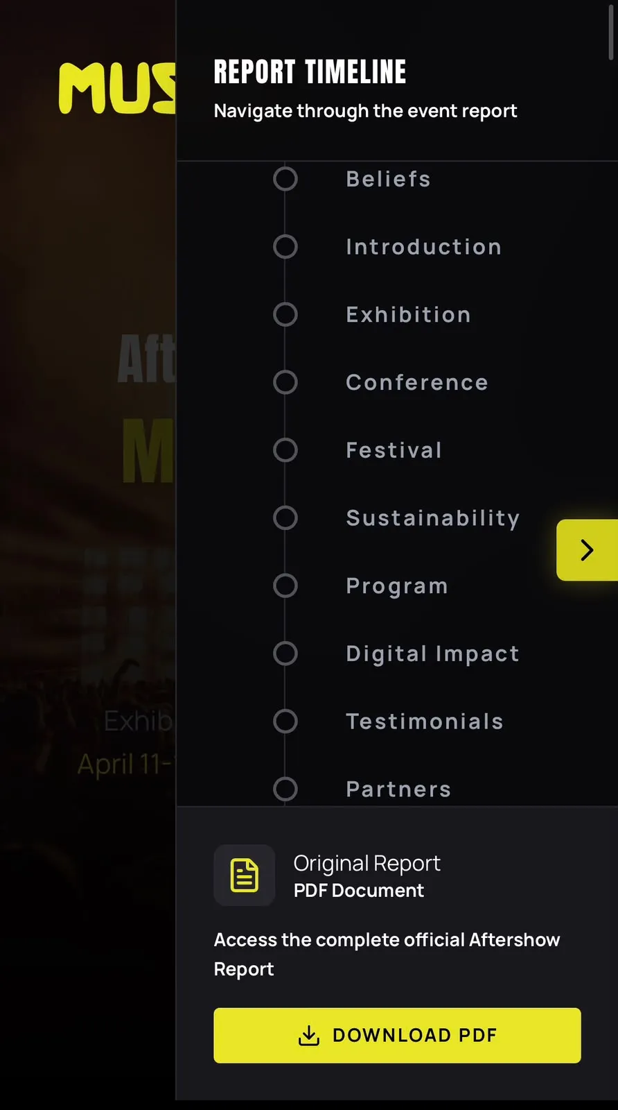

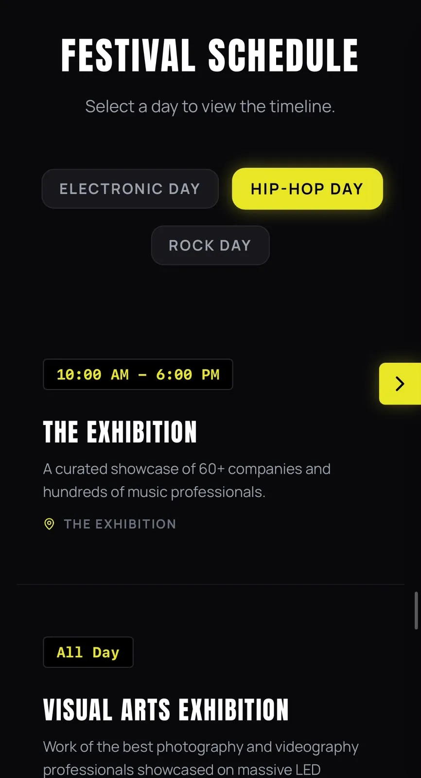
The report manages complexity through structure. Clear navigation and a deliberate rhythm between data and narrative provide structure and make the report easy to digest.