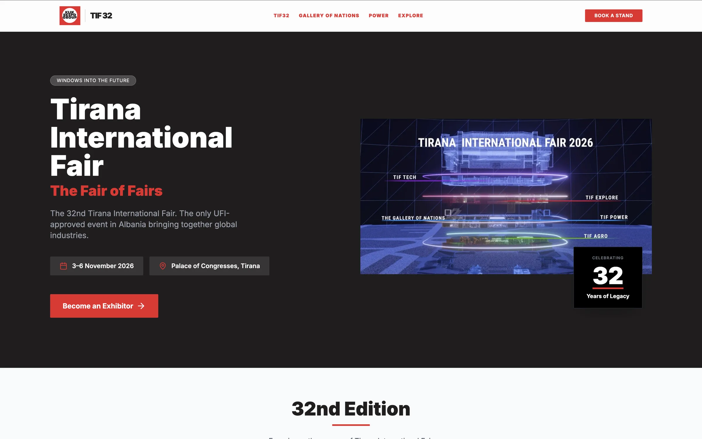
A multi sector event platforms need to communicate how they make diverse components come together, under one unified umbrella.
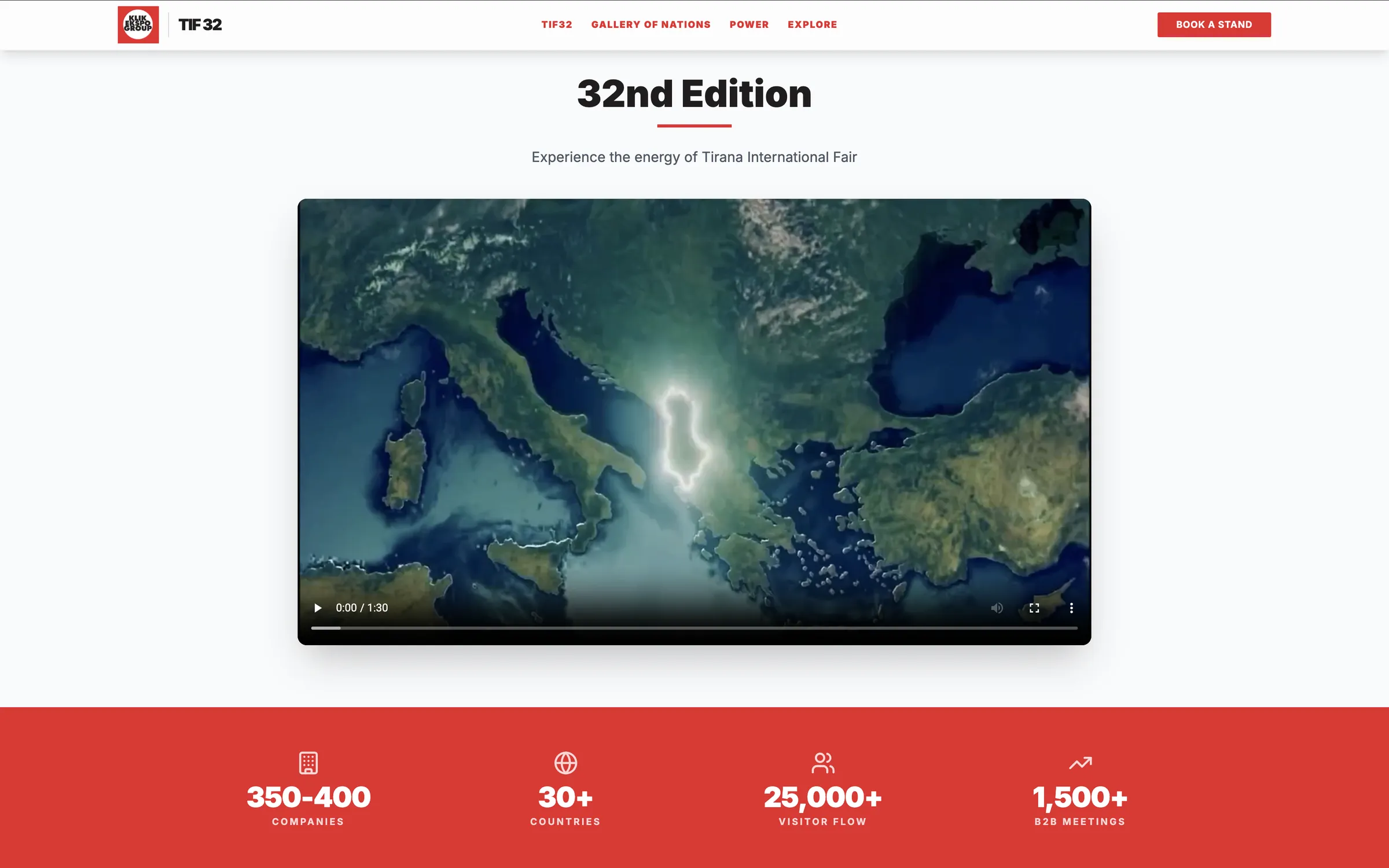
A disciplined, pattern based layout keeps a genuinely complex platform scannable by layering content from headline down to supporting detail.
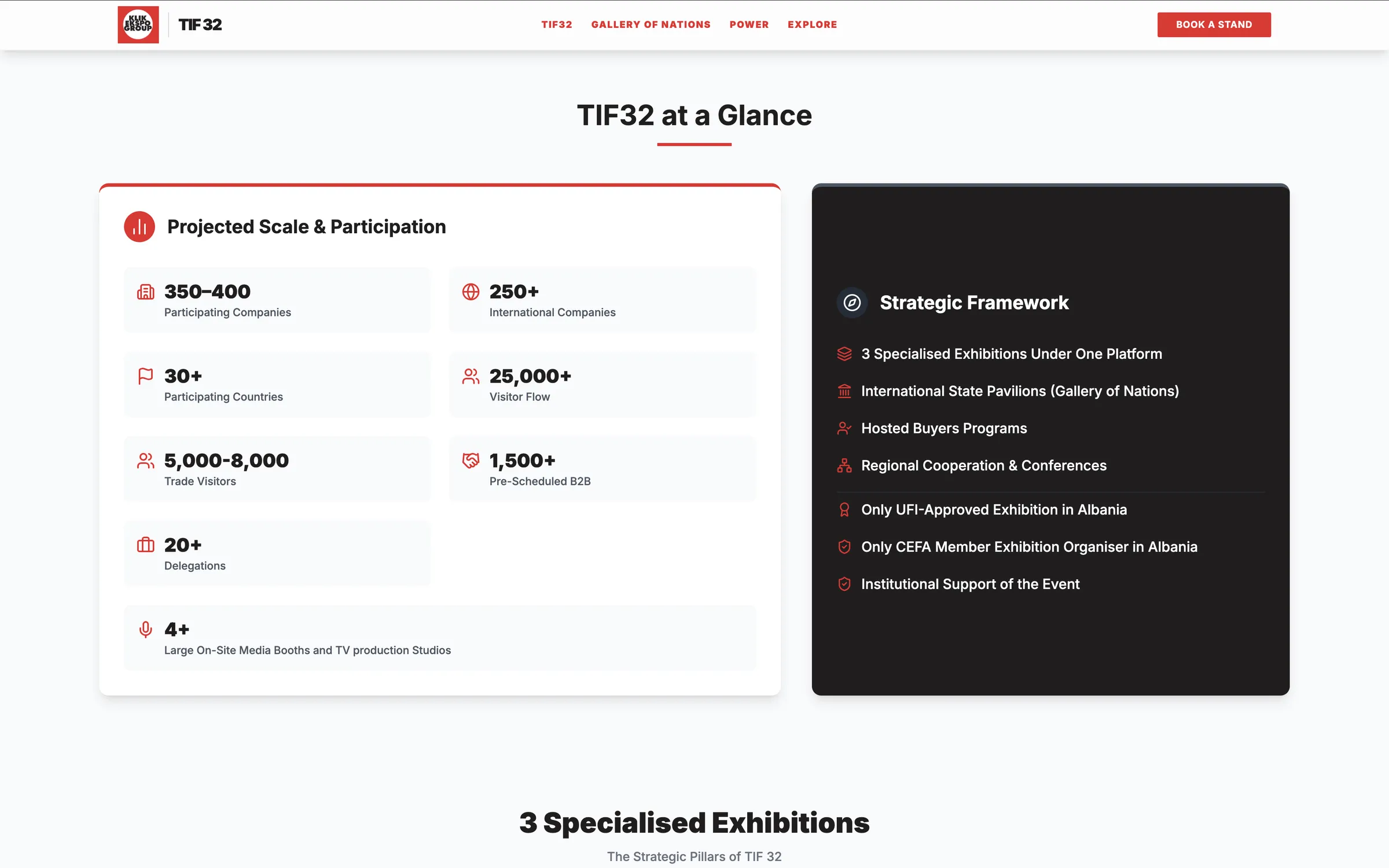
Key statistics, company count, countries represented, visitor flow, and B2B meetings, are each isolated in their own space with an icon and minimal label, so the numbers themselves carry the visual weight and register in seconds.
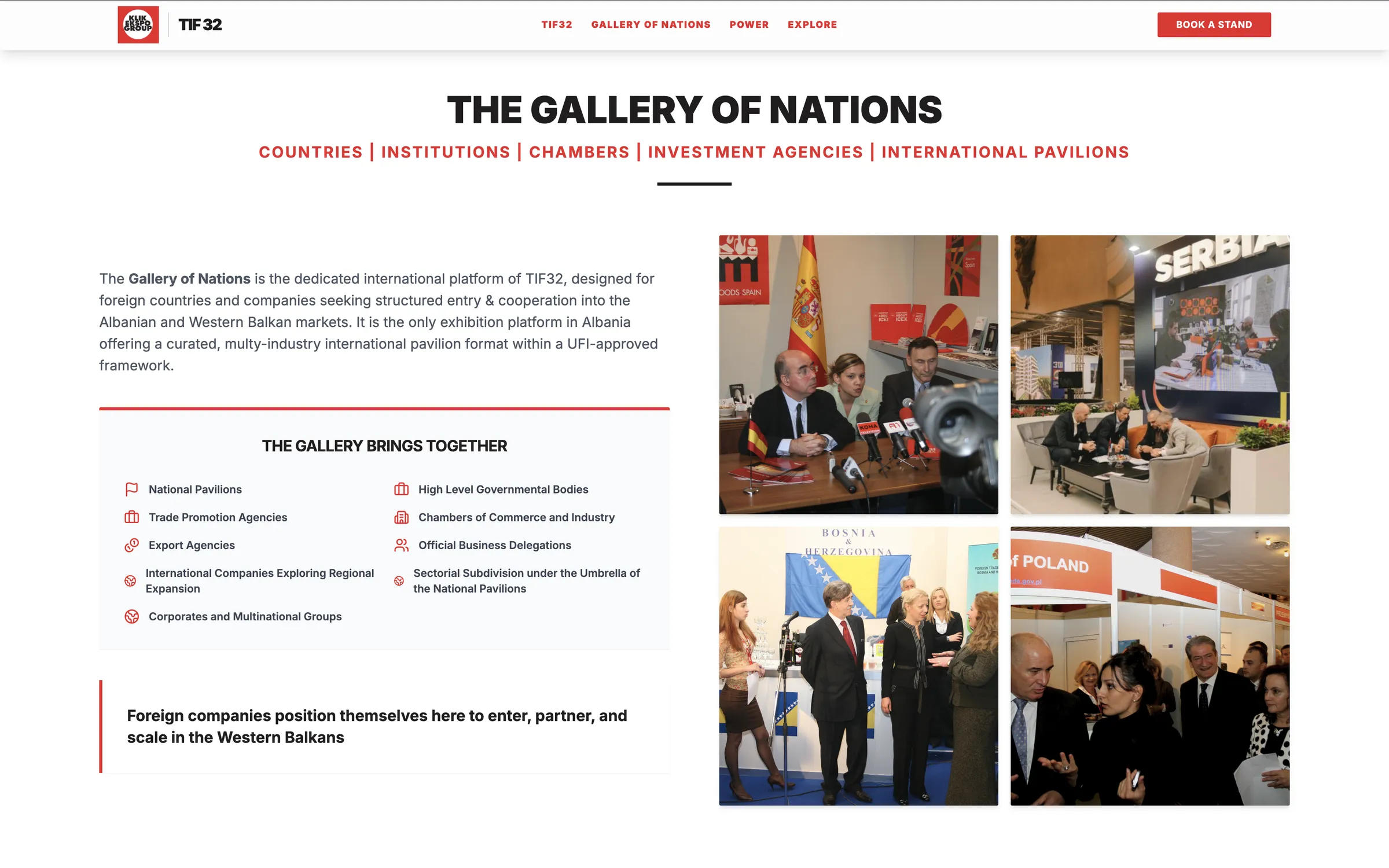
Specialized tracks, from energy and infrastructure to tourism to international pavilions, are kept in their own separate cards, so each offering stays digestible on its own rather than blending into a single dense list.
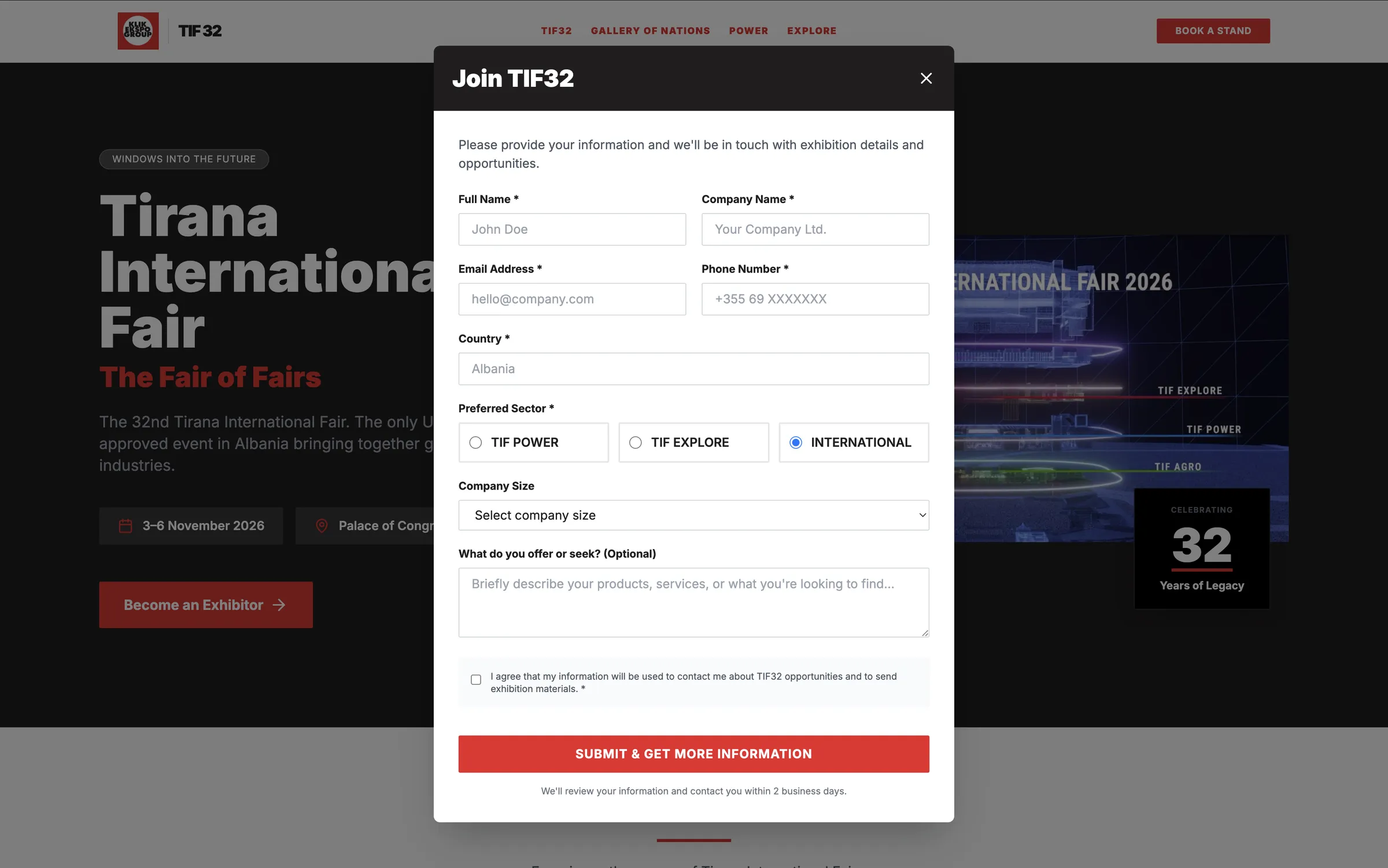
Each section uses color to signal its purpose: a bold background for the metrics section conveys urgency and importance, a light background keeps value cards calm and readable, and a dark background marks the forward looking new model section as distinct from what came before.
Four columns is a deliberate choice for the value proposition grid, enough to compare items side by side without cramming, and without scattering attention the way a wider grid would.
In the comparison section, muted text recedes and bold white text advances, telling the story of transformation visually before a single word is read.
The same icon, heading, and description structure repeats across sections, so users don't have to relearn how to read the page as they move from value propositions to metrics to program details.
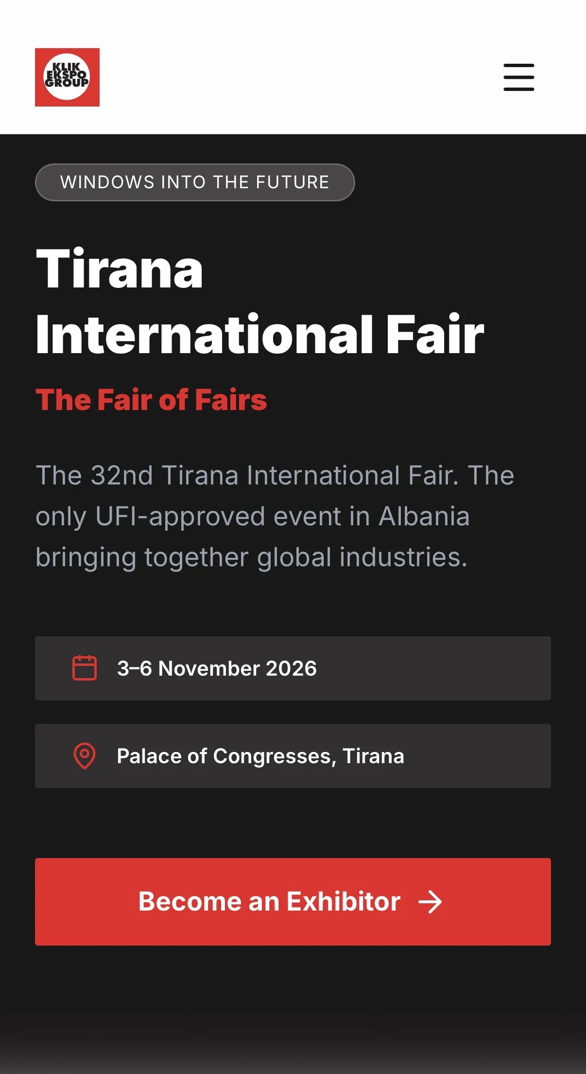
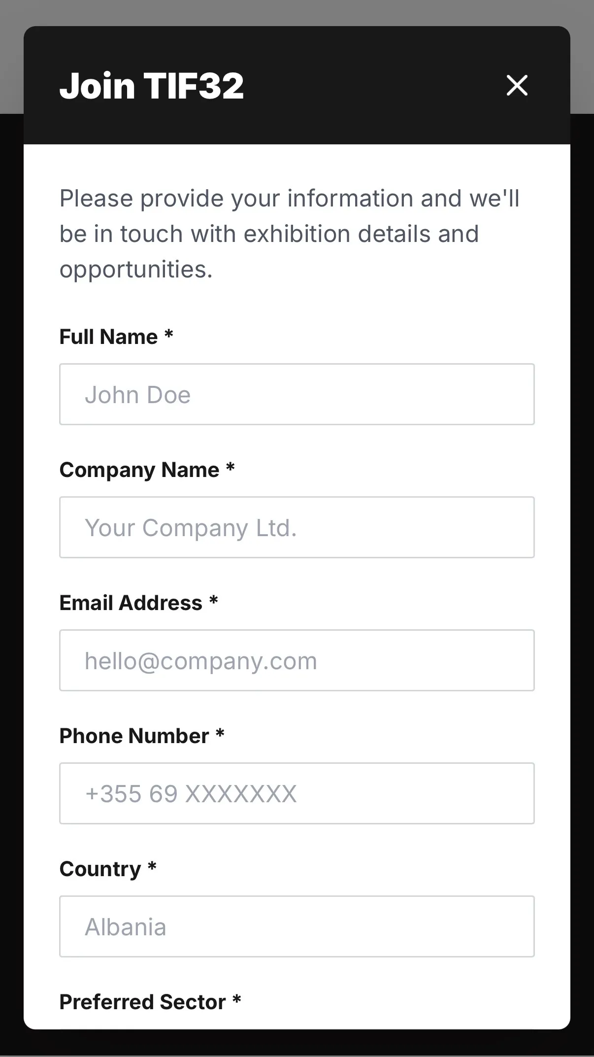
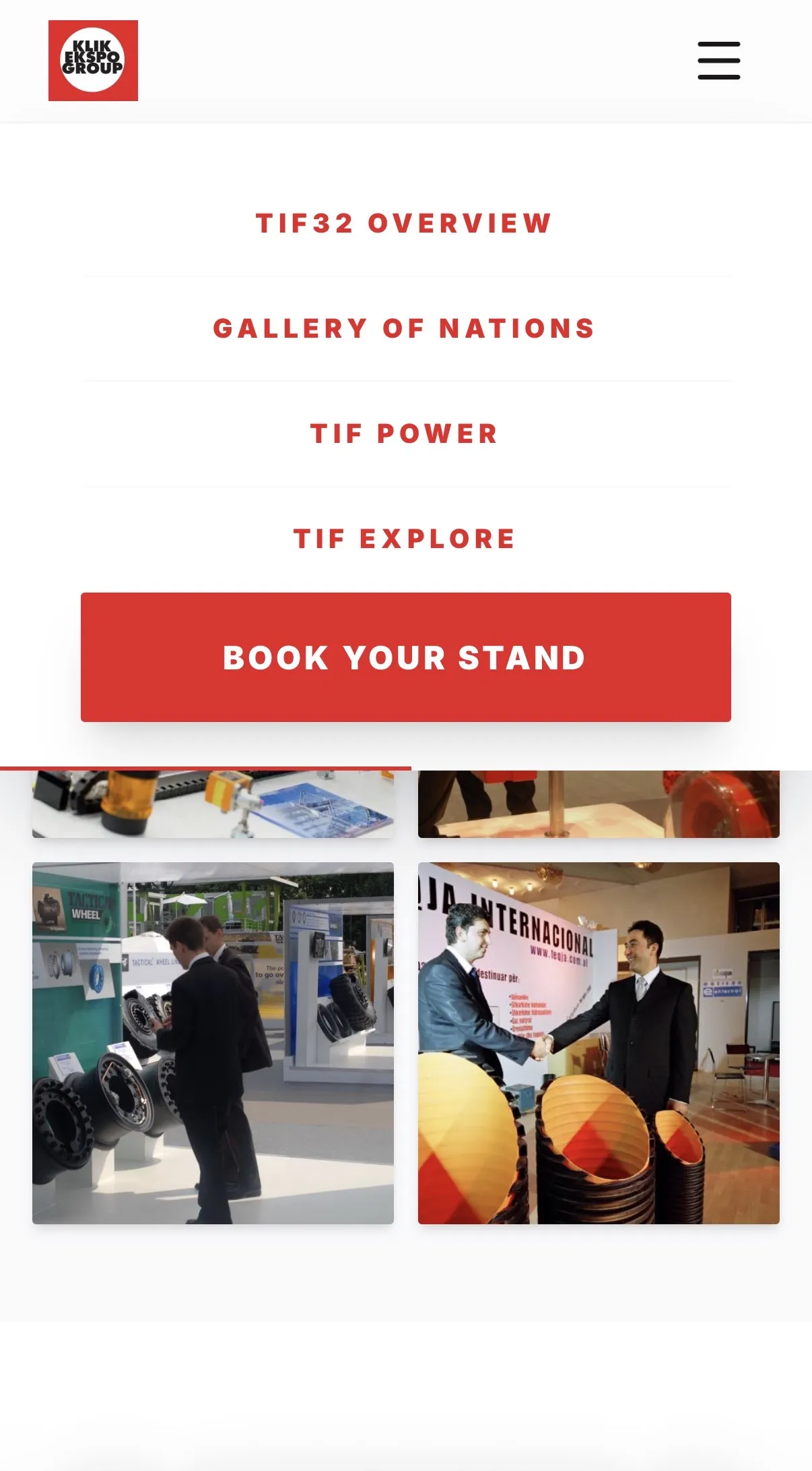
Complexity here is handled through structure: consistent patterns, isolated metrics, and a clear visual comparison let a platform covering multiple sectors and strategic points stay clean and scannable at every section.