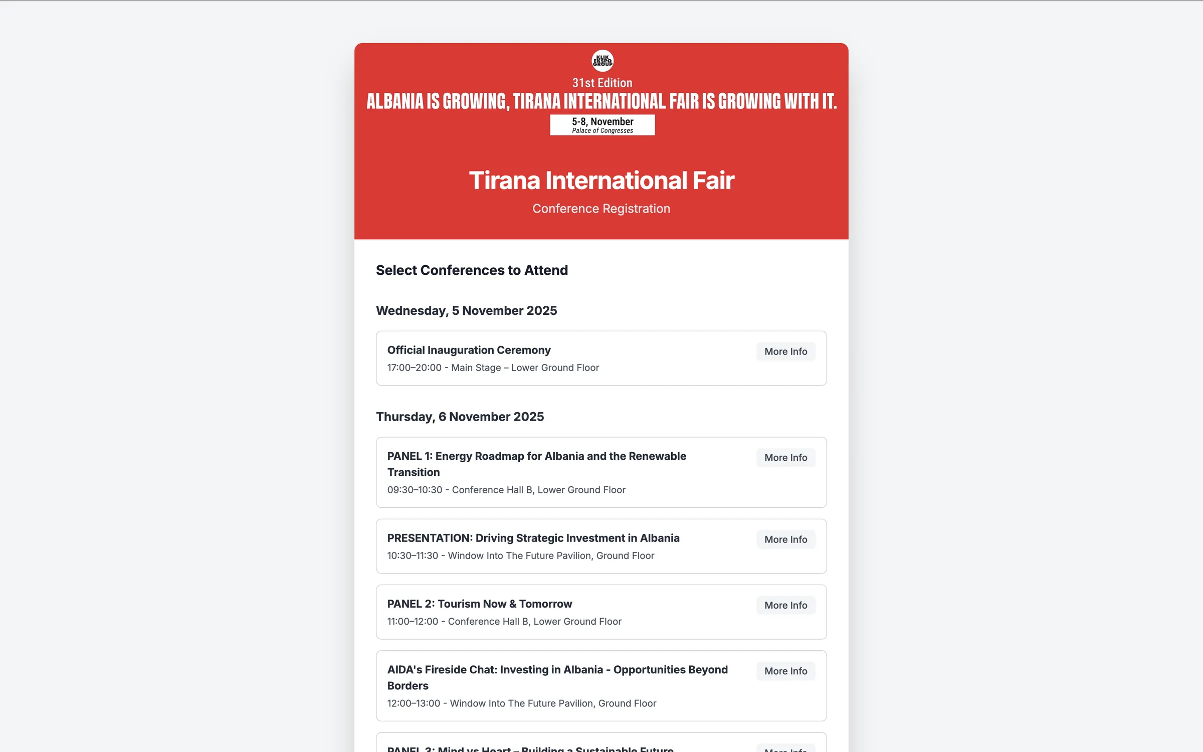
A 3 day conference with more than thirty sessions across topics from energy panels to fashion shows to fireside chats created a real risk of decision fatigue for attendees. Without a clear, structured way to browse and select sessions, potential attendees could get overwhelmed choosing what to attend, and the organization risked losing registrations to a confusing signup process.
A progressive disclosure based registration system breaks a complex multi day schedule into simple, sequential decisions.
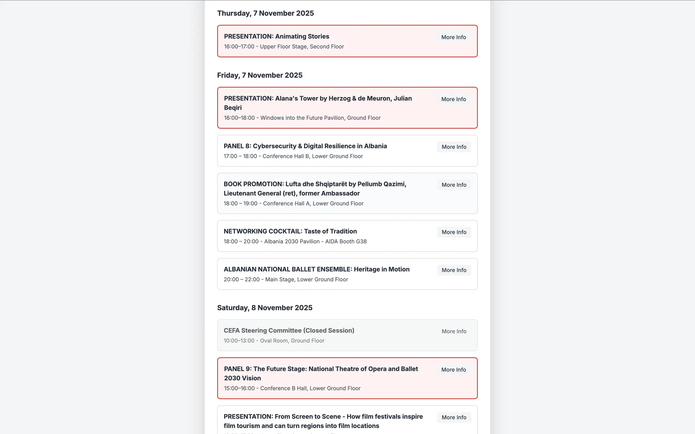
Sessions are grouped by day, moving from the start of the conference through to the close, with clear time slots that reduce the mental load of scanning everything at once.
Checkboxes let attendees select sessions instantly, without navigating to separate pages or working through a multi step process for each choice.
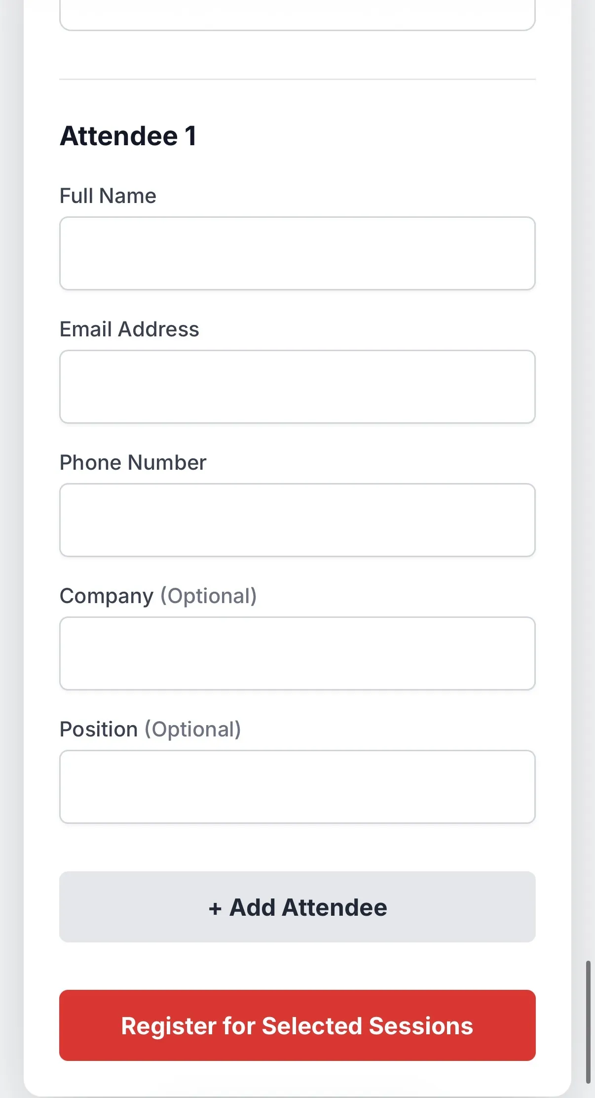
An "Add Attendee" option lets groups register together in one pass rather than repeating the process per person.
Every selection feeds into a single registration form at the end, replacing what would otherwise be a series of separate submissions.
A bold hero banner with a strong tagline opens the page and sets the tone, while session cards keep a consistent layout: title first, time and location as secondary text, a checkbox for scanning, and a details toggle on the right.
A red header creates urgency and ties directly into the event's branding, set against a white background and subtle card borders that keep dozens of sessions readable without visual clutter.
A "More Info" toggle expands to reveal full descriptions, agendas, and collaborating organizations only when an attendee wants them, keeping the default view scannable.
A single "Register for Selected Sessions" button closes the flow, backed by validation messaging that guides attendees if something is missing.
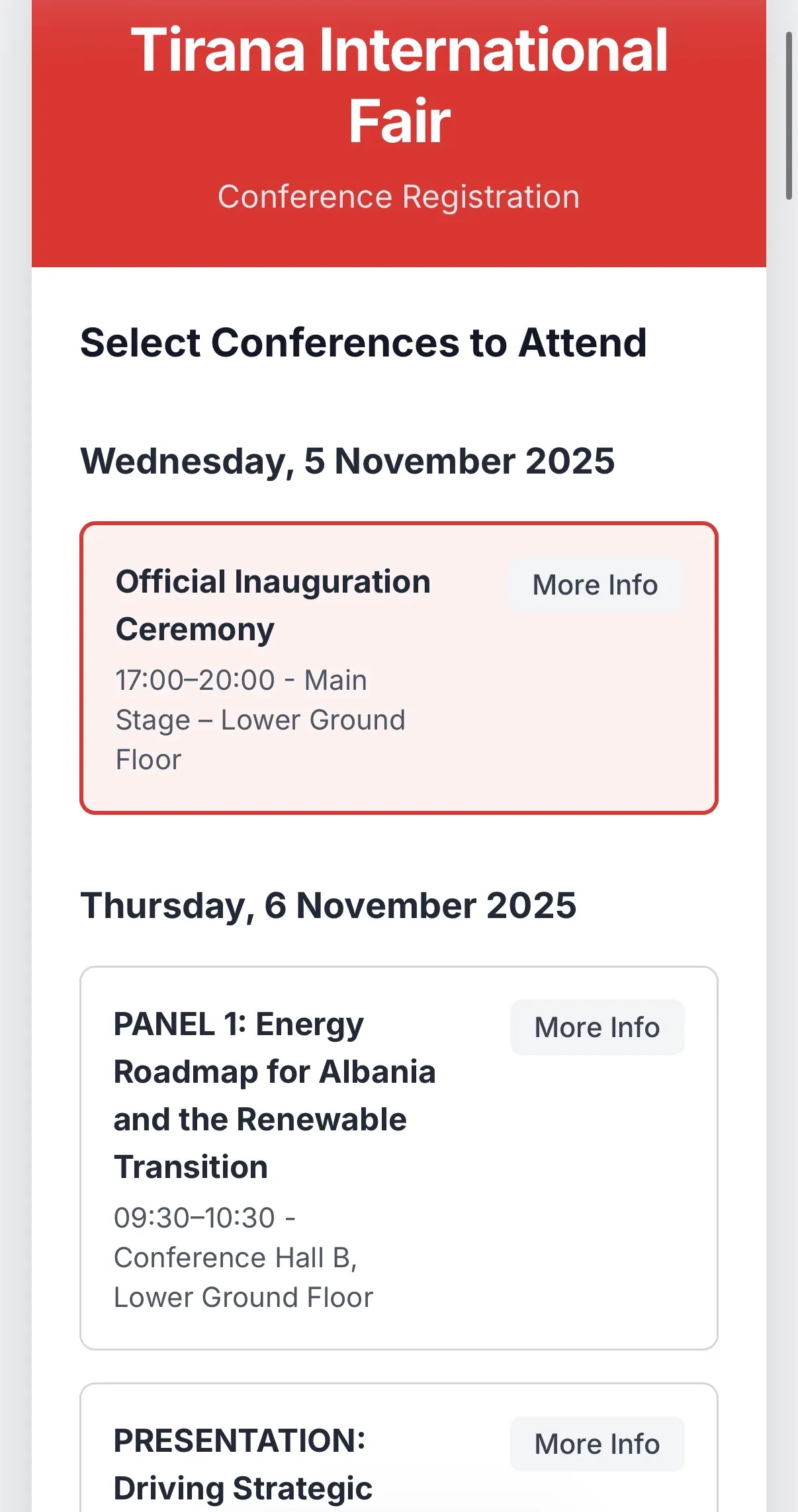
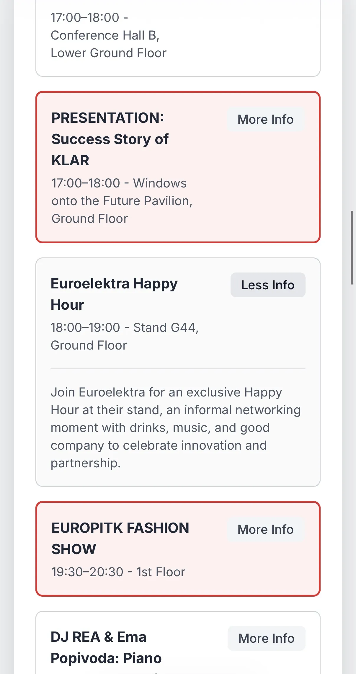
Breaking a dense, multi day schedule into a chronological, progressively disclosed selection flow turns what could be an overwhelming registration process into a series of small, manageable decisions, right up to one clear final action.