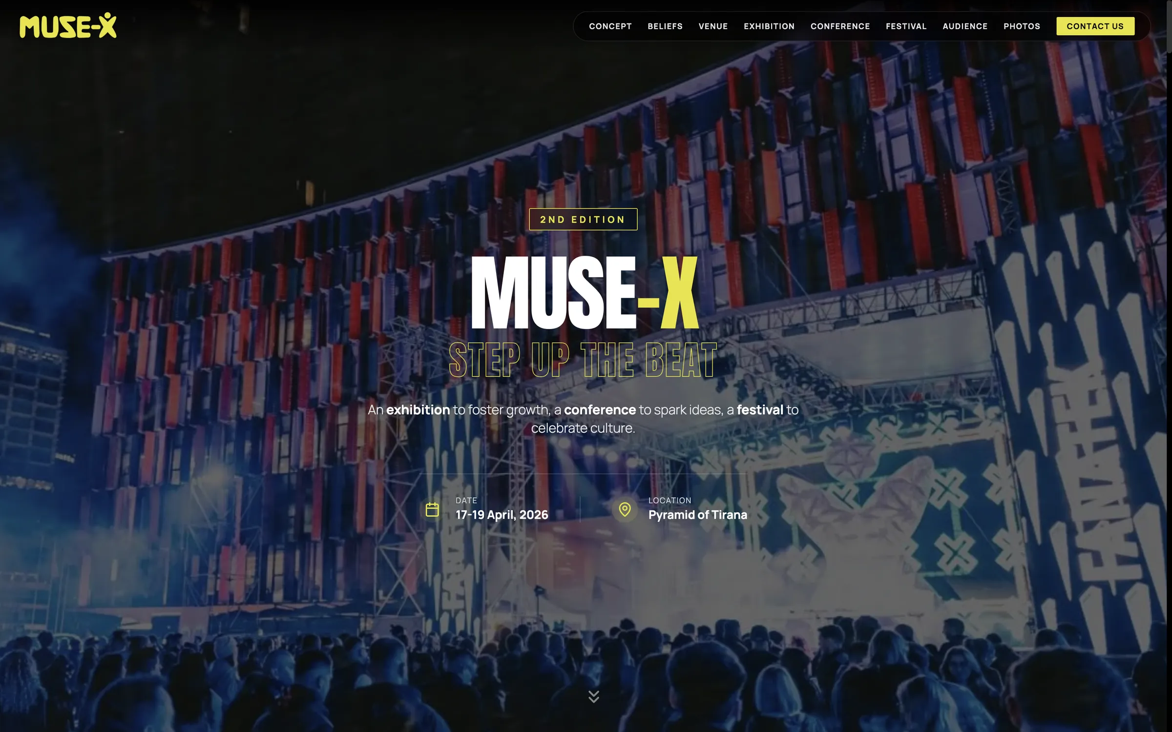
A second edition site needed to build anticipation for a cross-sector exhibition, conference, and festival months ahead of the event. The site had to feel established and worth returning to.
The site leads with what's already proven, last year's scale and energy, before asking visitors to take next year's still-forming program on faith.
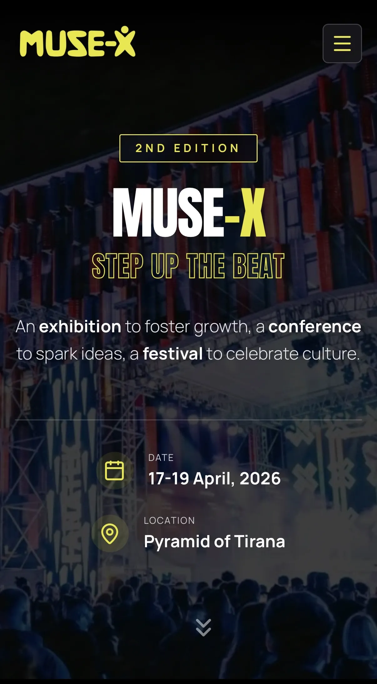
A branded preloader, "Synchronizing Beats & Bytes," greets every visitor before the site resolves. It gives way to a high-contrast black and yellow hero carrying a "2nd Edition" badge, dates, and venue, immediately signaling this is a returning, established event rather than a first attempt.
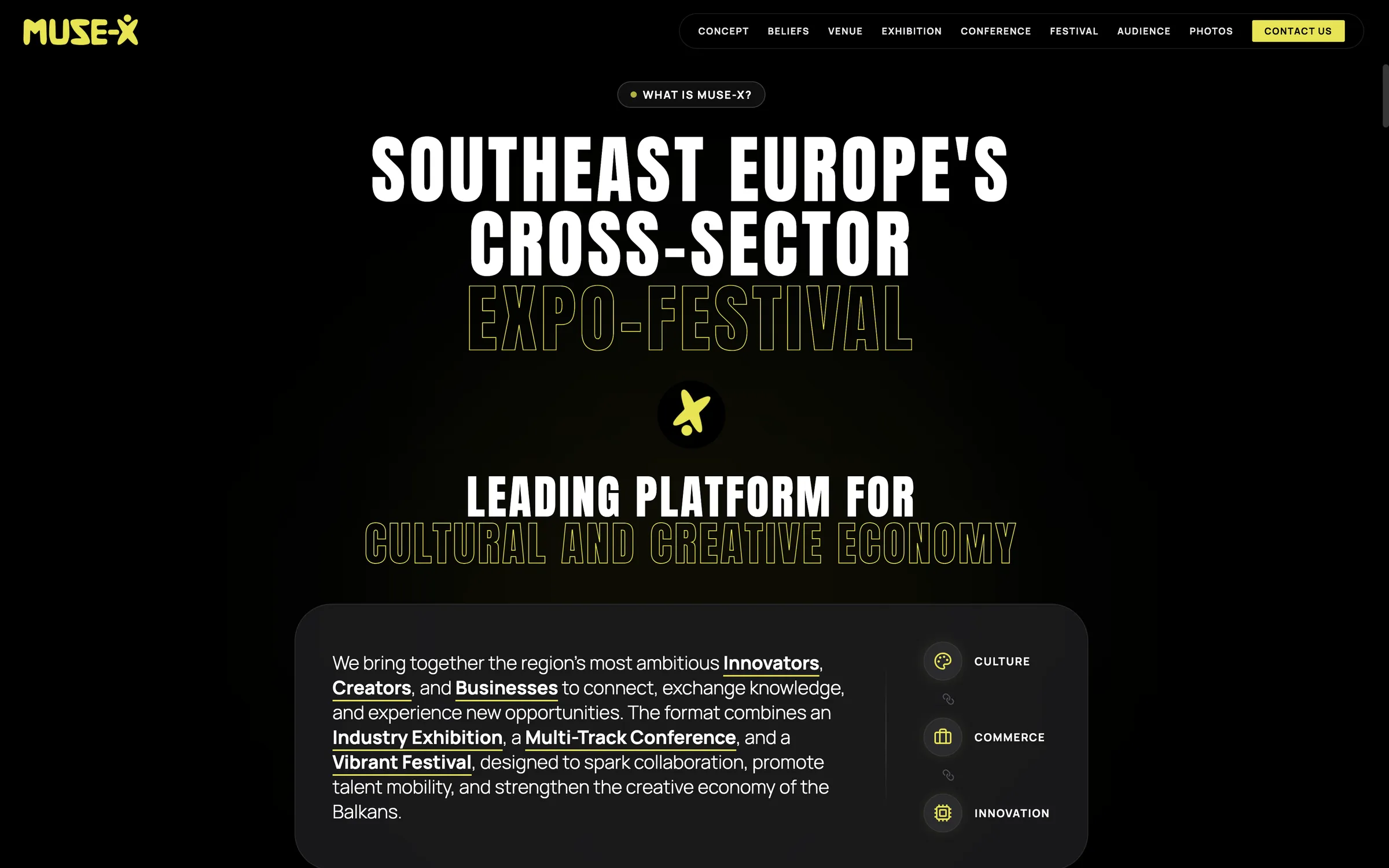
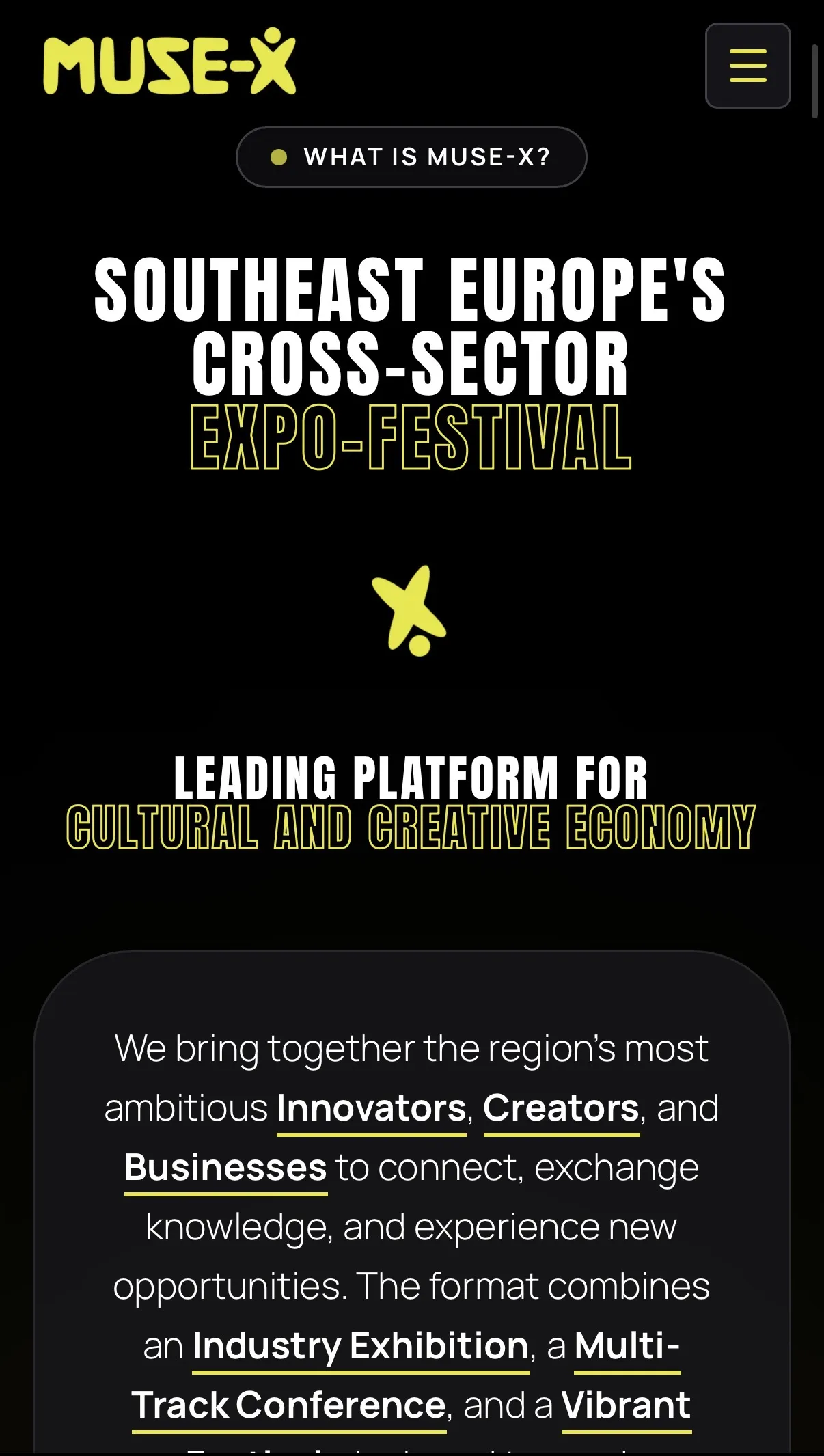
A bold, oversized headline positions MUSE-X as Southeast Europe's cross-sector expo-festival, then breaks its format into three linked pillars, Culture, Commerce, and Innovation, each with its own icon, so the concept reads in seconds even for a first-time visitor.
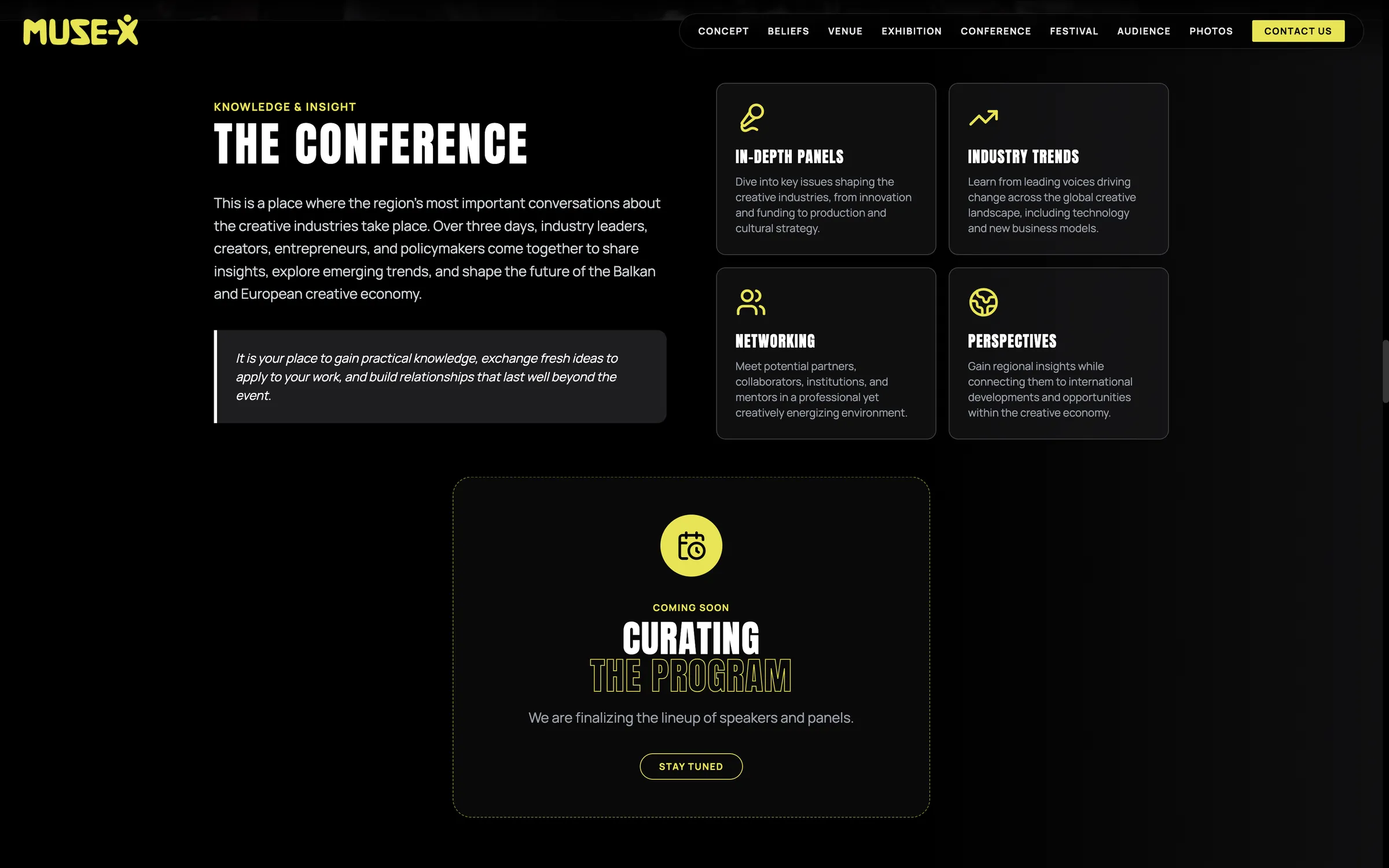
The Conference section pairs four fully designed value cards with a dashed-border "Curating the Program" placeholder. The unfinished part of the site is framed as active work in progress rather than a dead end.
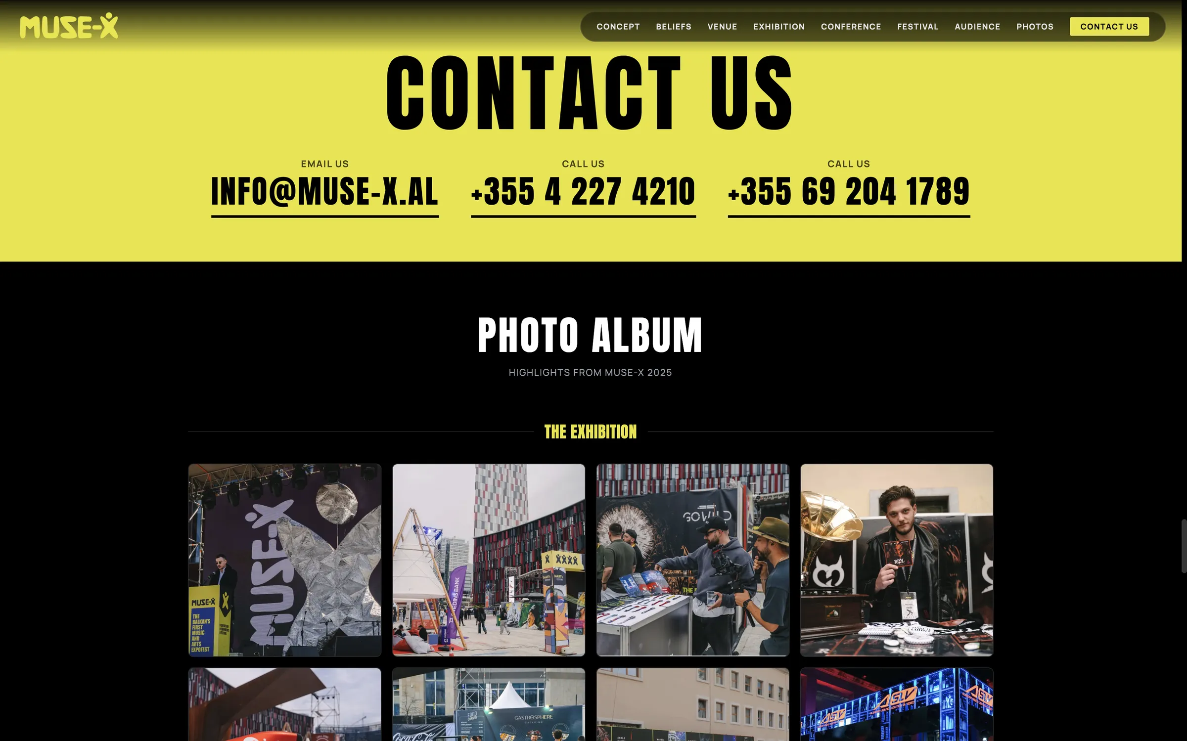
A full photo album of the previous edition sits below the contact section, giving visitors tangible evidence of scale and atmosphere, exhibition stands, crowds, performances.
A near-black background with a single saturated yellow accent runs through the preloader, hero, navigation, and every call to action, keeping a visually loud brand consistent rather than diluted across sections.
Culture, commerce, and innovation, and later each conference value proposition, are paired with a matching icon, letting visitors scan the page's structure before reading a single line.
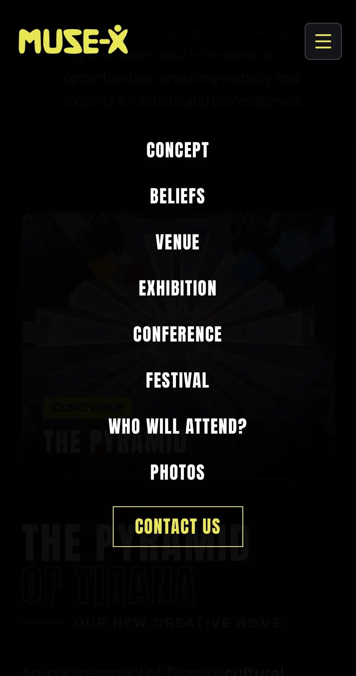
A consistent high-contrast identity, a clear three-pillar concept, an honestly framed "coming soon" state, and proof drawn from the previous edition let the site sell a second edition on established credibility, not just promises.