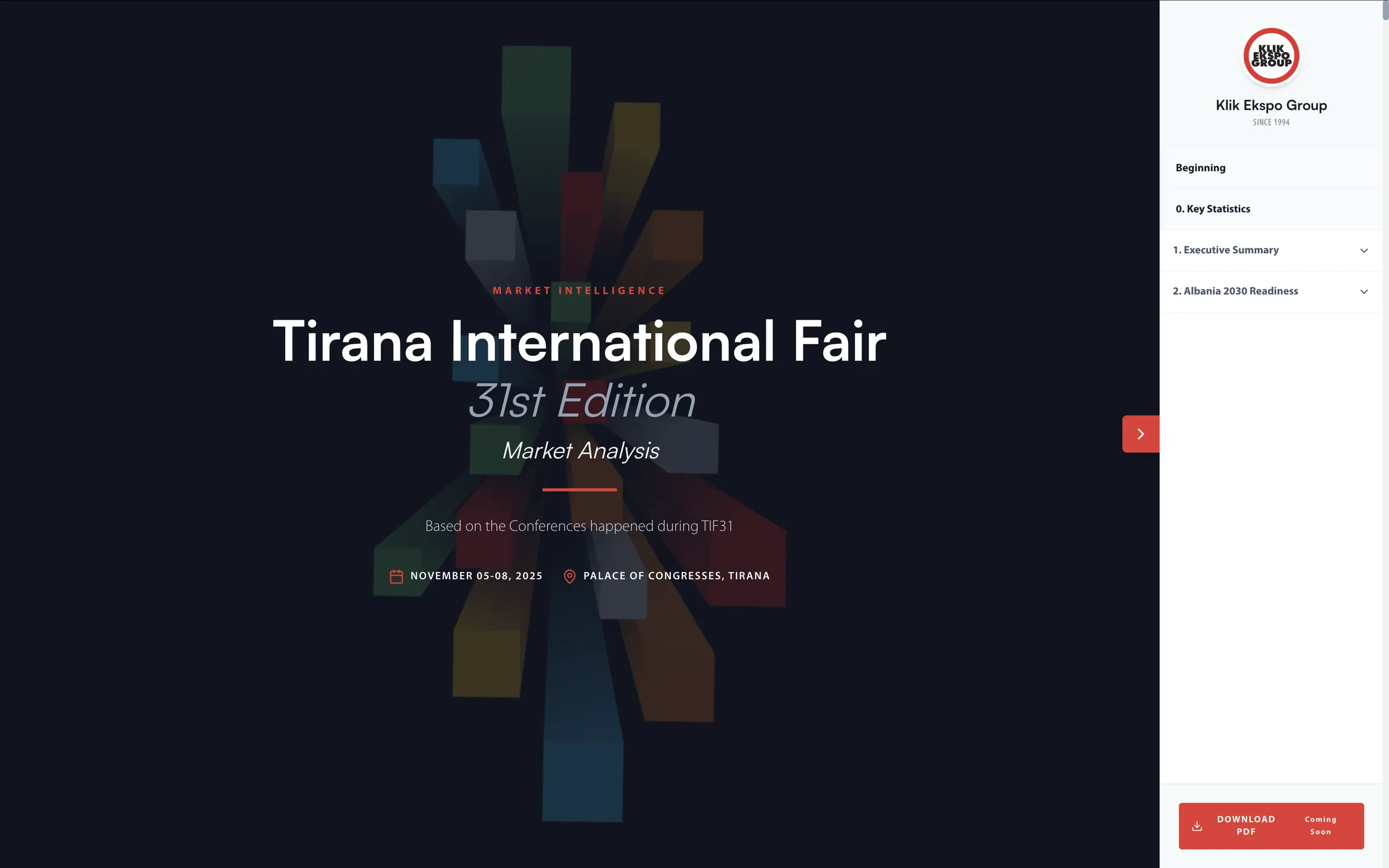
A research document needed to support two very different reading habits at once: readers scrolling straight through the narrative, and readers jumping directly to a specific finding. Traditional long form reports, whether flat PDFs or a single scrolling page, tend to force one behavior and leave readers lost, with no clear sense of where they are in the document or how much is left.
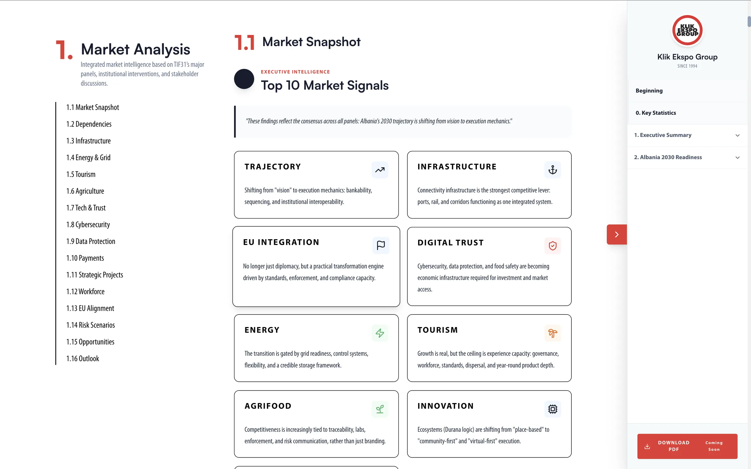
A sticky, numbered navigation sidebar turns the report into something readers can move through on their own rather than a document they have to scroll through blindly.
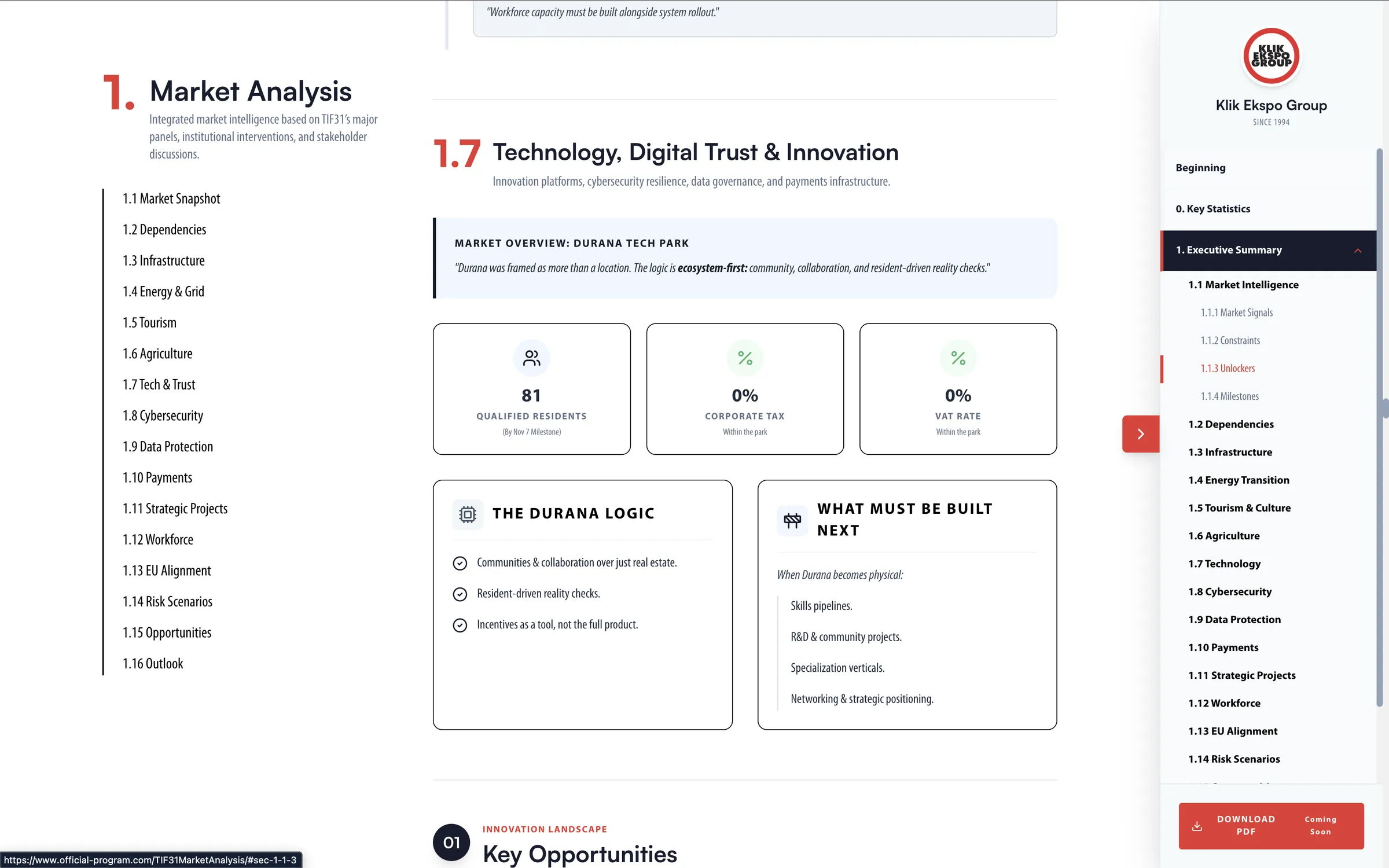

The sidebar stays visible as users scroll, so the full menu is always one click away without ever needing to scroll back to the top. Sections are grouped under an initial "Beginning" category, then numbered sequentially from there.
The active section is marked with a colored left border and a darker background, so there's never a question of which section a reader is currently in.
Dropdown indicators let sections expand and collapse, keeping the menu compact while still giving access to every part of the report.
Separating introductory content from the numbered analysis sections helps readers navigate by report phase.
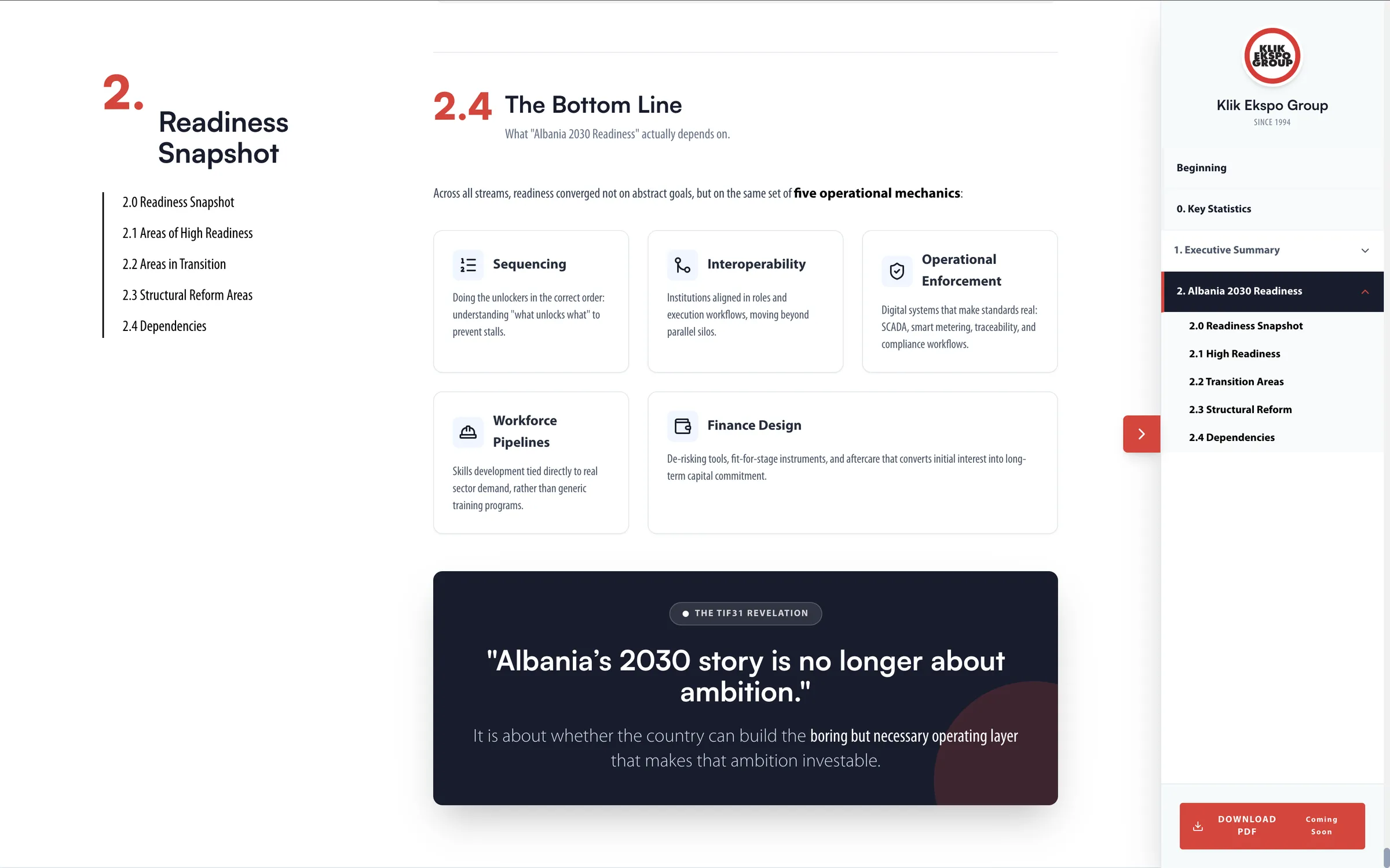
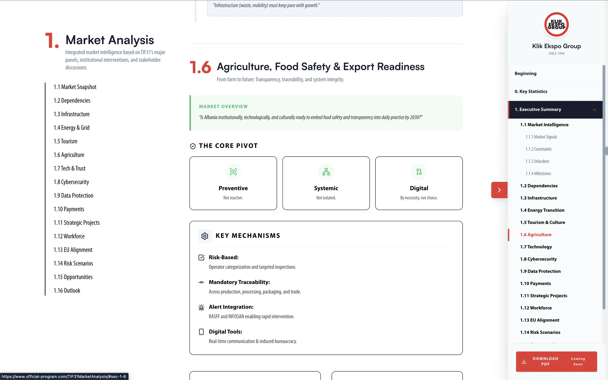
The accent color used for the active state matches the report's overall brand color, tying the navigation visually to the rest of the document instead of feeling like a bolted on menu.
The sidebar is sized to keep labels fully readable, while staying narrow enough that it doesn't compete with the main content for attention.


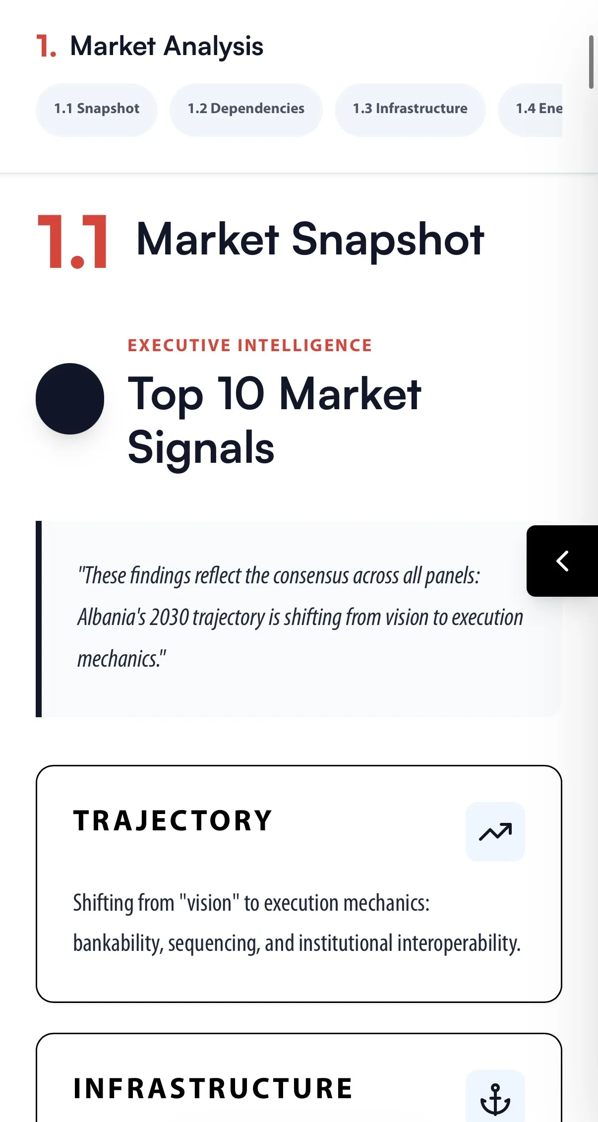
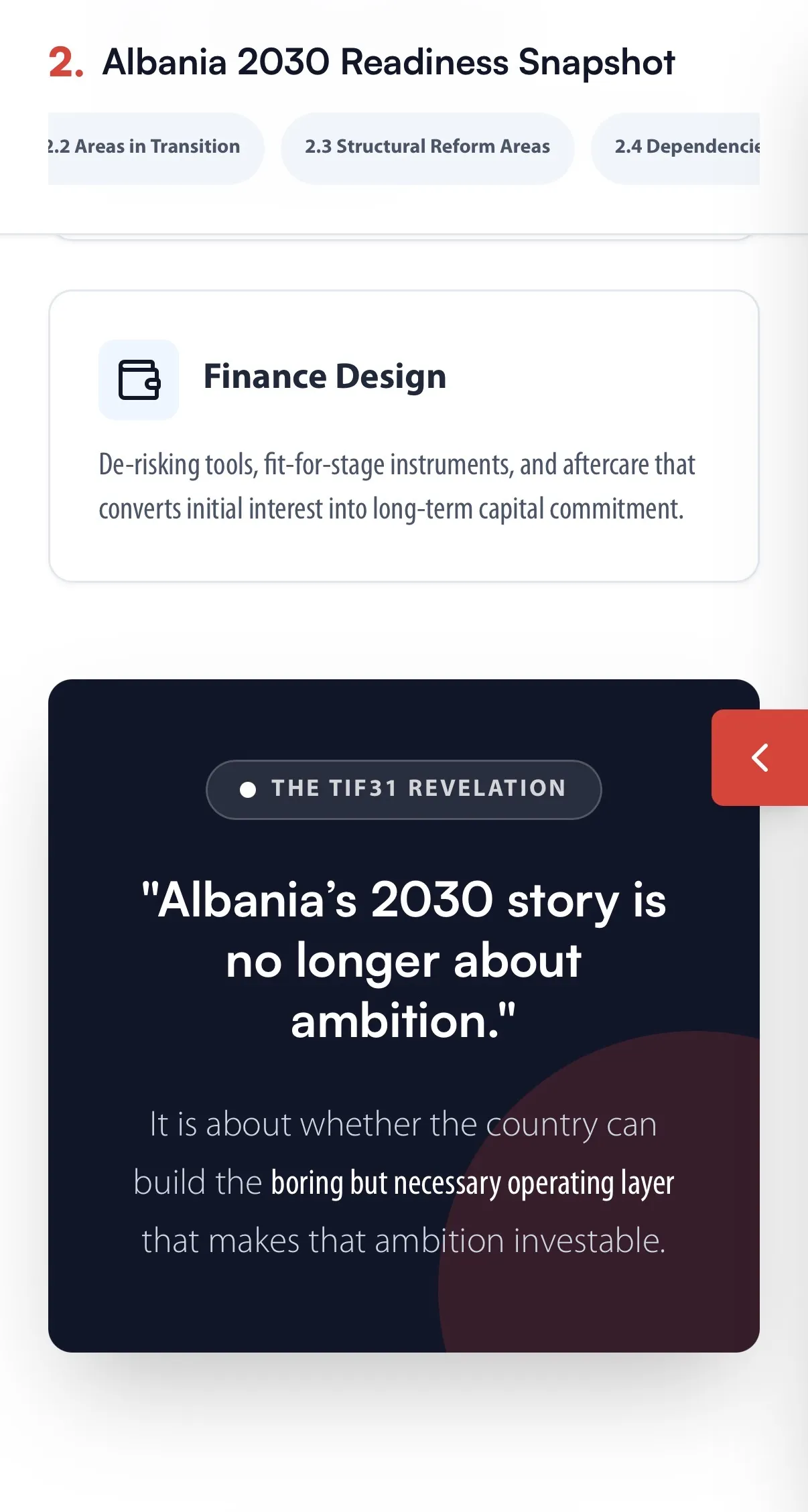
Effective navigation in a long report isn't decoration, it's part of the information architecture itself. A persistent, clearly stated, and semantically grouped sidebar turns a dense research document into something readers can actually navigate, whether they're reading start to finish or jumping straight to what they need.